The Principles Behind the Cozy
You know that feeling — you step into someone’s home in mid-October and everything just clicks. The sofa practically begs you to sit down, the light glows a little warmer than your own, and even their pumpkins look like they were styled by a magazine. It isn’t luck, and it isn’t a huge budget. It’s design principles, quietly working behind the scenes.
Fall decorating hits different because it leans on the oldest tricks in the interior design book: layering, contrast, scale, and textures you want to touch. Once you understand the why behind these fifteen ideas, you’ll never stare at a bag of mini pumpkins wondering what to do with them again. Let’s walk through them one principle at a time.
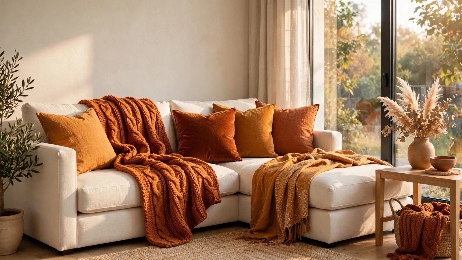
1. Layer Your Textiles Like a Designer
Start with the base layer. In the image above, the sofa is dressed the way you would dress for October: a light linen throw as the foundation, a chunky knit blanket tossed over one arm, and cushions in graduated tones of amber, rust, and cream. Layering is the fastest way to make a room feel autumnal without buying a single pumpkin, because it trains the eye to read depth and softness.
Why it works: designers call this visual weight — piled, touchable textiles signal comfort before your brain has time to argue. This suits: anyone whose living room photographs a little flat or “showroomy.” To recreate this look, gather an odd number of cushions in at least two sizes, and let one throw fall where it lands — perfectly folded blankets read formal, and fall is anything but formal.
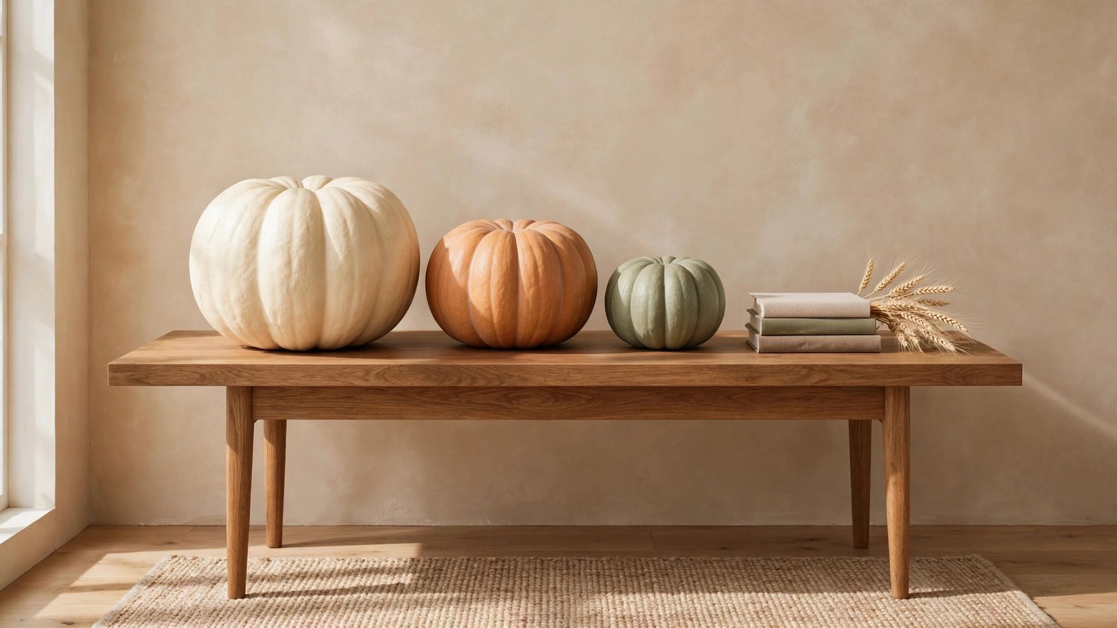
2. Group in Threes, Never in Twos
Count before you style. Look at the console table in the image above: three pumpkins — one large, one medium, one small — in ivory, muted orange, and sage. A pair of objects reads as bookends, but three reads as a composition, because your eye keeps moving between them instead of settling. It’s the oldest styling rule there is, and it costs nothing.
Why it works: odd numbers create gentle asymmetry, which the brain finds more interesting than perfect symmetry. This suits: mantels, consoles, and coffee tables that always feel “almost done.” To recreate this look, pick one hero piece, one medium piece, and one small accent, and vary their heights by at least a few inches — the height difference is what makes the trio feel effortless rather than lined up.
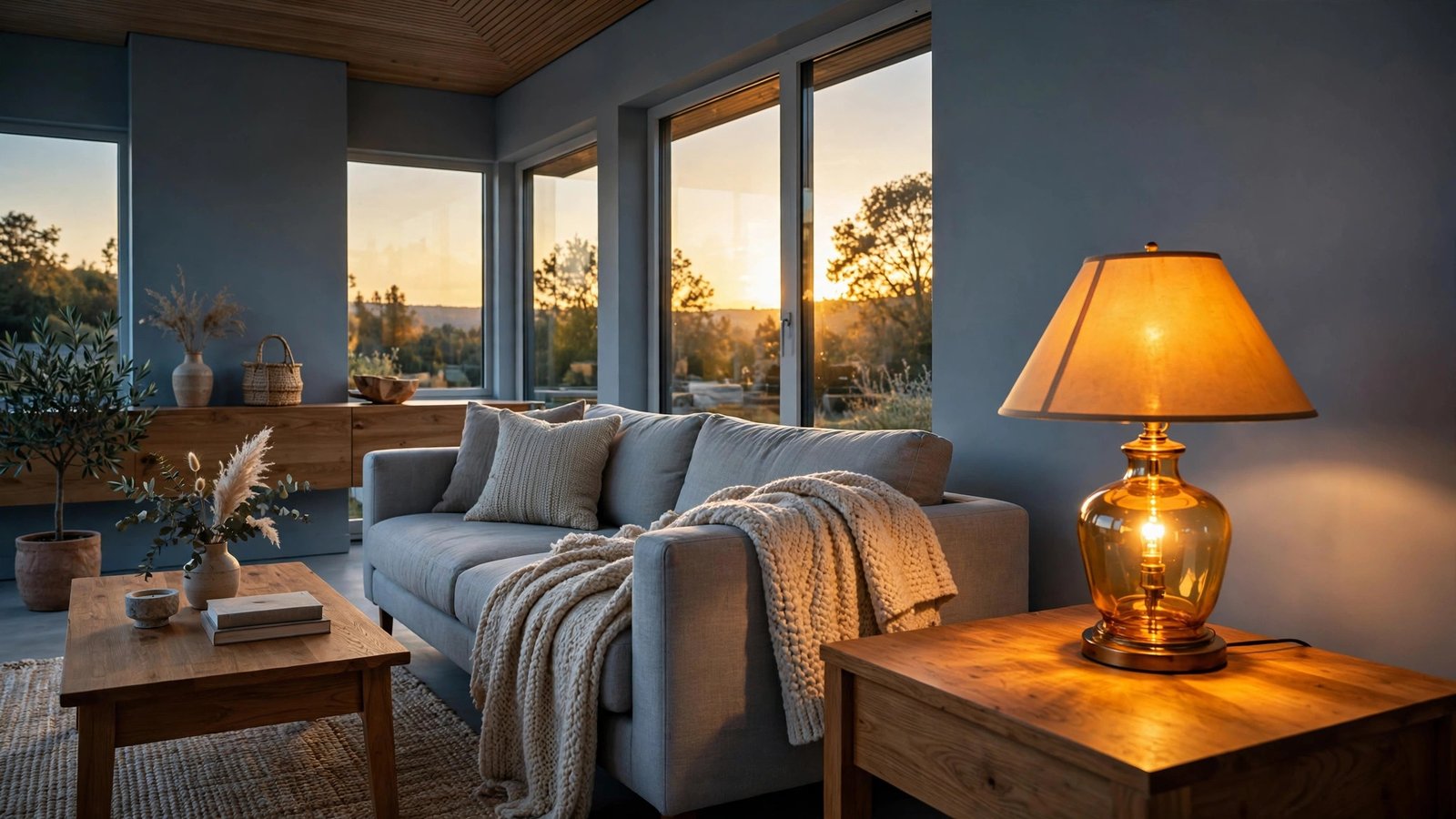
3. Let Warm Light Argue with Cool Walls
Contrast is a conversation. The room in the image above has cool, grey-blue walls — and that’s exactly why the amber lamp glow feels so delicious. Warm light against a cool backdrop creates the kind of contrast designers chase all year, but fall makes it easy: lamps on earlier, candles lit by six, fairy lights unapologetically out.
Why it works: our eyes are drawn to the warmest thing in any scene, so a glowing corner becomes an instant focal point. This suits: anyone with white, grey, or sage walls who worries fall colors will clash. They won’t — the contrast is the point. To recreate this look, swap one cool-white bulb for a warm 2700K one near your favorite chair, and add a second light source at a different height, like a candle or a low string of lights.
4. Give Every Room a Focal Point
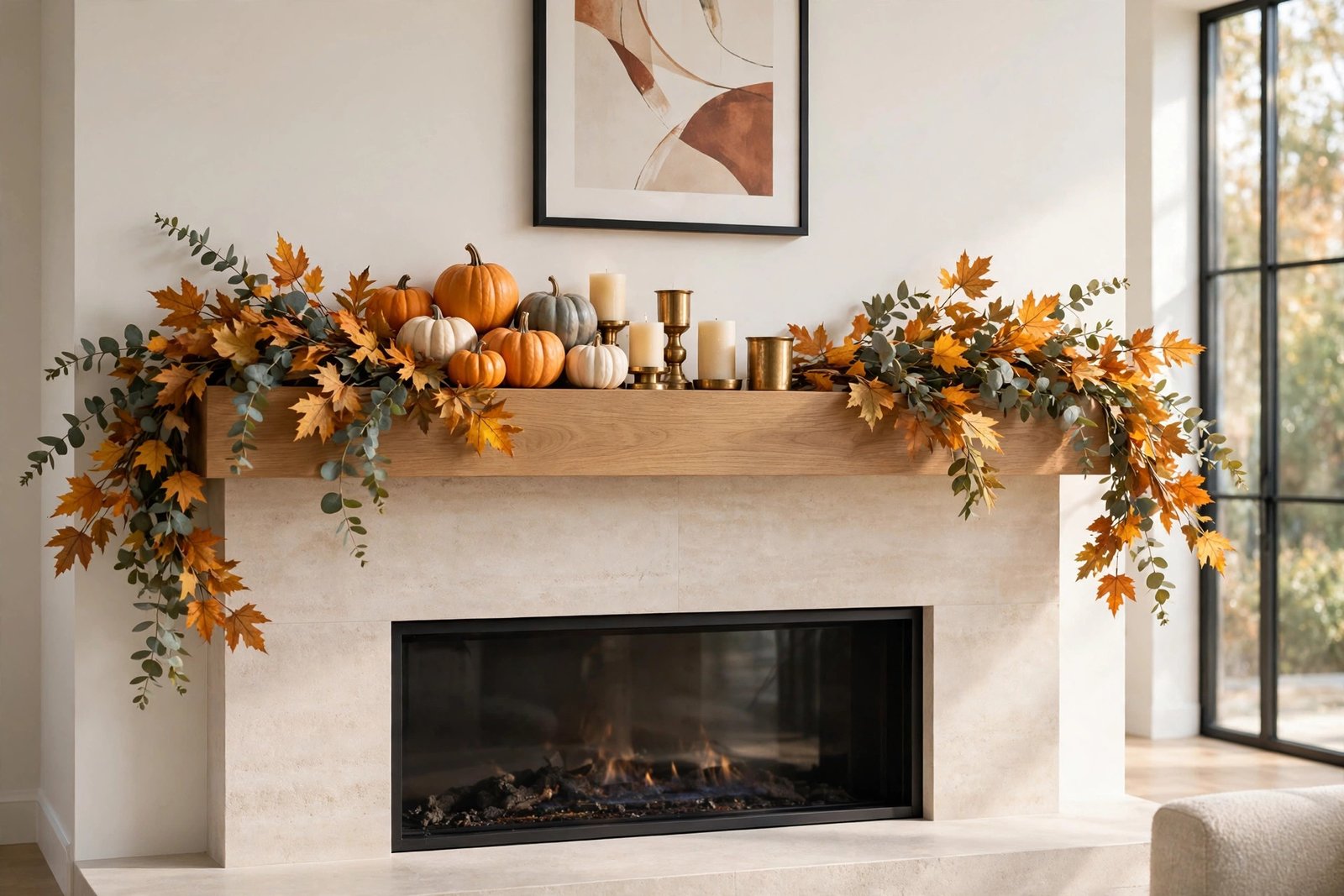
Decide what the room is about. In the image above, the mantel does all the talking: a draped garland, a cluster of small pumpkins, brass candlesticks catching the light. Every room needs one spot that answers the question “where do I look first?” — and fall gives you the perfect excuse to build one.
Why it works: a focal point organizes everything else in the room around it, so the rest of your decor suddenly looks intentional. This suits: open-plan spaces that feel scattered, or rooms where the eye bounces around with nowhere to land. To recreate this look, anchor your mantel (or shelf, or sideboard) with one tall element in the center, then build outward with lower pieces in odd-numbered clusters.
READ MORE >> 15 Halloween Decor Ideas for 2026 That Feel Fresh, Not Cliché
5. Scale Up with One Oversized Statement
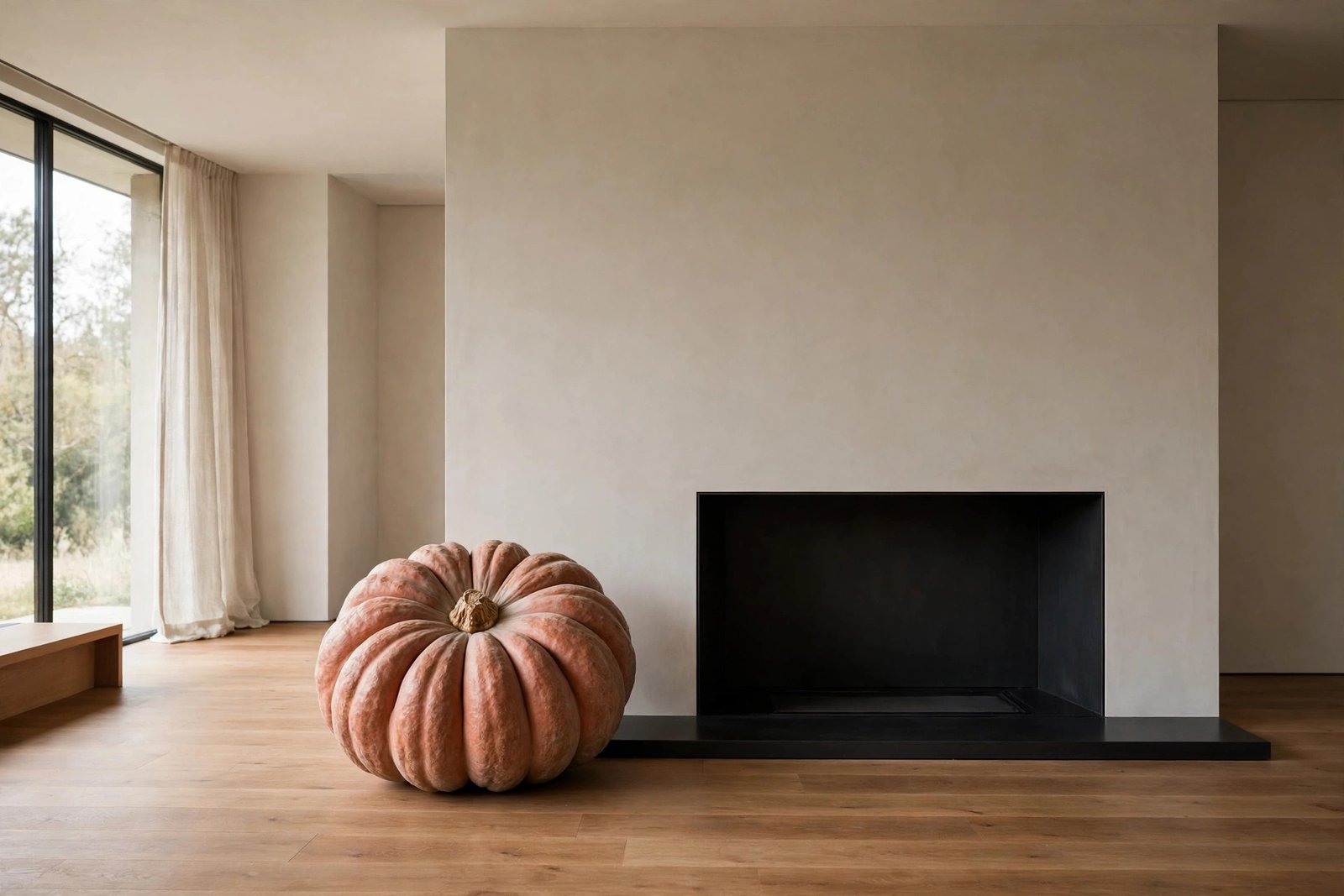
Go big once. The image above breaks every “little pumpkin everywhere” habit: one single oversized heirloom pumpkin in muted terracotta, sitting proudly beside a sleek fireplace. When everything in a room is roughly the same size, nothing stands out. One dramatically scaled piece fixes that instantly.
Why it works: designers use scale contrast to create drama — the giant pumpkin makes the whole room feel more curated by comparison. This suits: minimalists who want to participate in fall without the clutter, and small rooms where many small objects just read as mess. To recreate this look, choose one item at least twice the size you’d expect, give it breathing room on all sides, and resist the urge to add “just one more thing” next to it.
6. Repeat Natural Materials Until They Sing
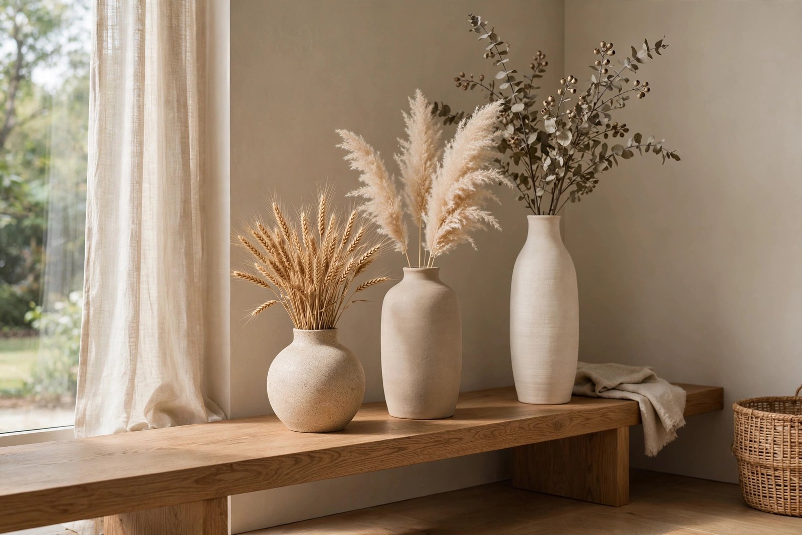
Repetition is rhythm. In the image above, dried wheat, pampas grass, and eucalyptus appear again and again along a low oak bench in three different vases. The same materials, repeated at different heights, turn a few inexpensive stems into something that looks designed rather than decorated.
Why it works: repetition tells the eye “this was on purpose,” which is the difference between styling and scattering. This suits: long surfaces — consoles, benches, dining sideboards — that feel empty in the middle. To recreate this look, buy one bundle of dried stems and split it across three vessels of different heights; stick to a tight palette of two or three materials so the repetition reads clearly.
7. Warm Up the Color Temperature
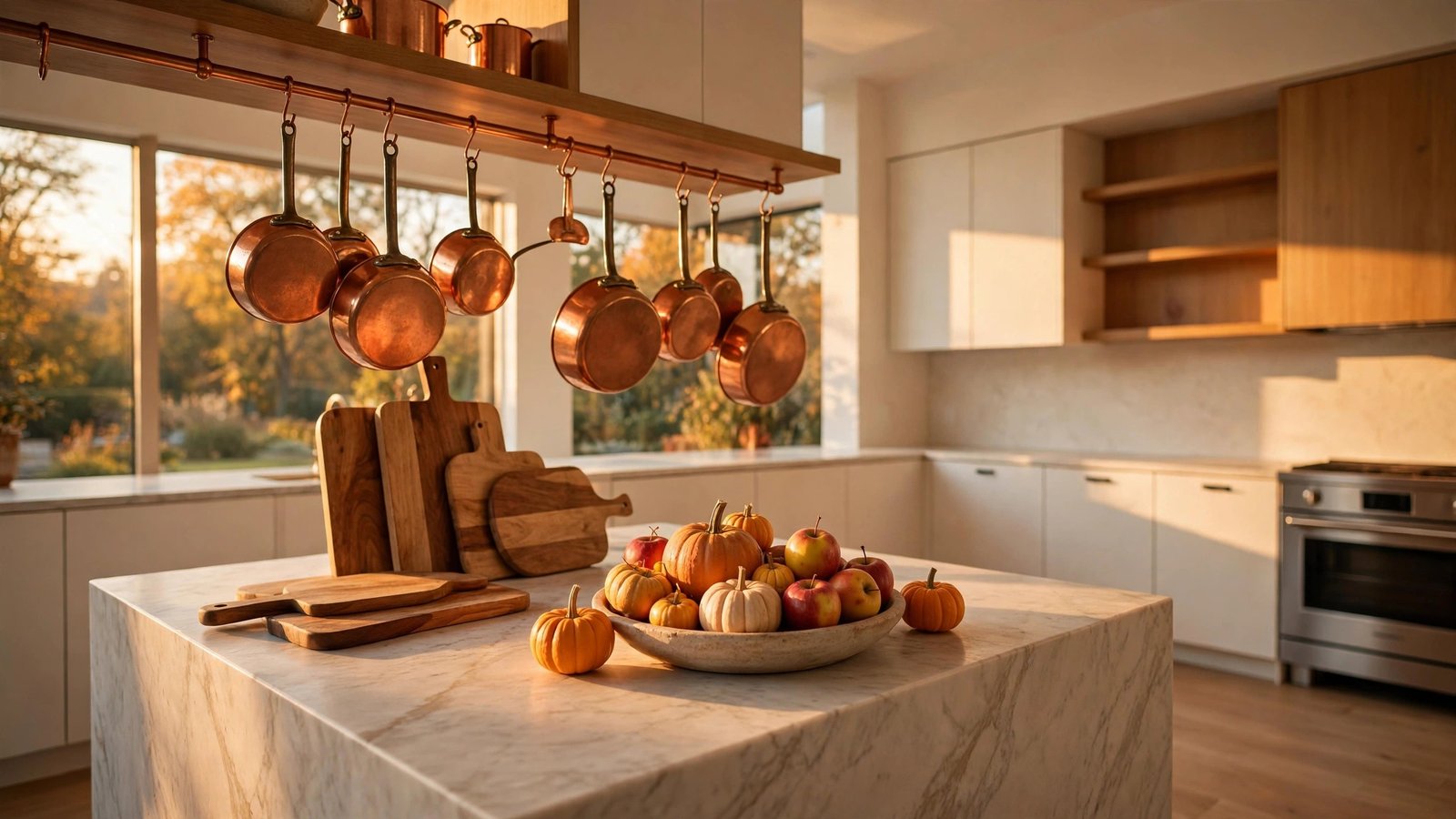
Think in degrees, not just colors. The kitchen in the image above glows with copper pots, honey-toned wood, and a bowl of small pumpkins — every surface nudging the room’s color temperature warmer. You don’t need to repaint; swapping in warm metals and amber tones shifts how the whole space feels.
Why it works: warm colors advance toward the eye while cool colors recede, so warm accents make a room feel closer and cozier. This suits: kitchens and dining areas with lots of stainless steel or white surfaces that feel clinical in autumn. To recreate this look, hang or display copper or brass pieces where you see them daily, and add one warm-toned bowl of seasonal produce — an instant temperature shift.
READ MORE >> 13 Gothic Library Halloween Ideas with Dark Academia Charm
8. Mix Textures Like You Mean It
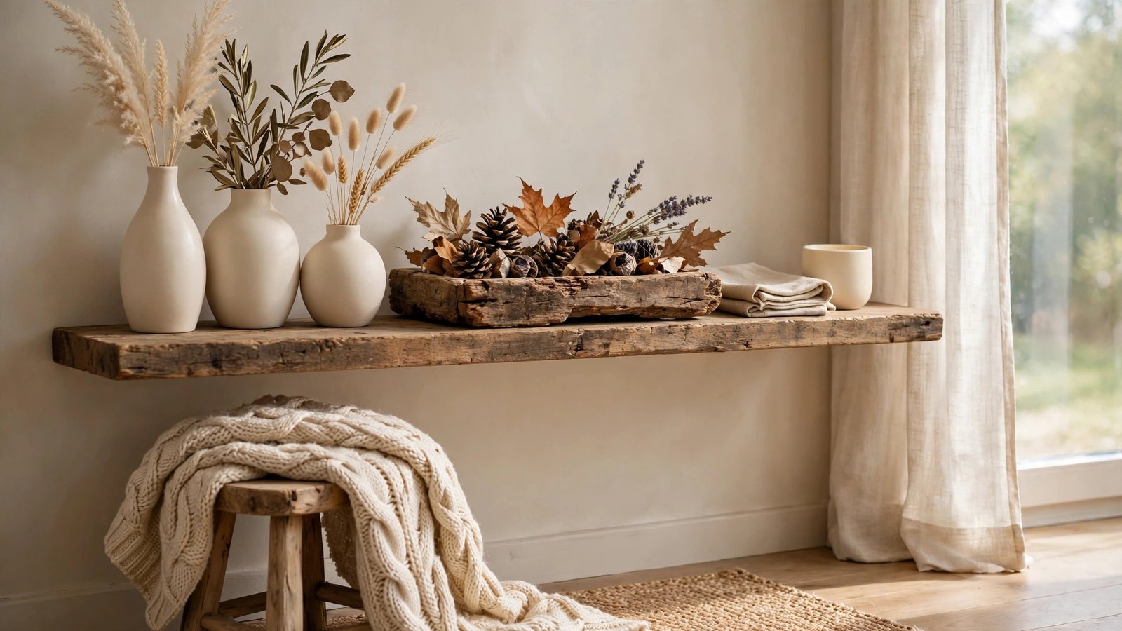
Touch everything first. The vignette in the image above is a texture sampler: a chunky knit throw, smooth cream ceramics, rough reclaimed wood, and crinkly dried leaves all sharing one small scene. Fall is the season of touch — wool, wood, stone, dried botanicals — and mixing them is what makes a corner feel rich instead of flat.
Why it works: contrasting textures catch light differently, so the eye reads more detail and depth in the same square footage. This suits: neutral rooms that look good in photos but feel boring in person. To recreate this look, gather any five objects and check that no two share the same finish — if everything is smooth, add something nubby; if everything is matte, add one glossy ceramic.
9. Light in Layers, Not Just Lamps
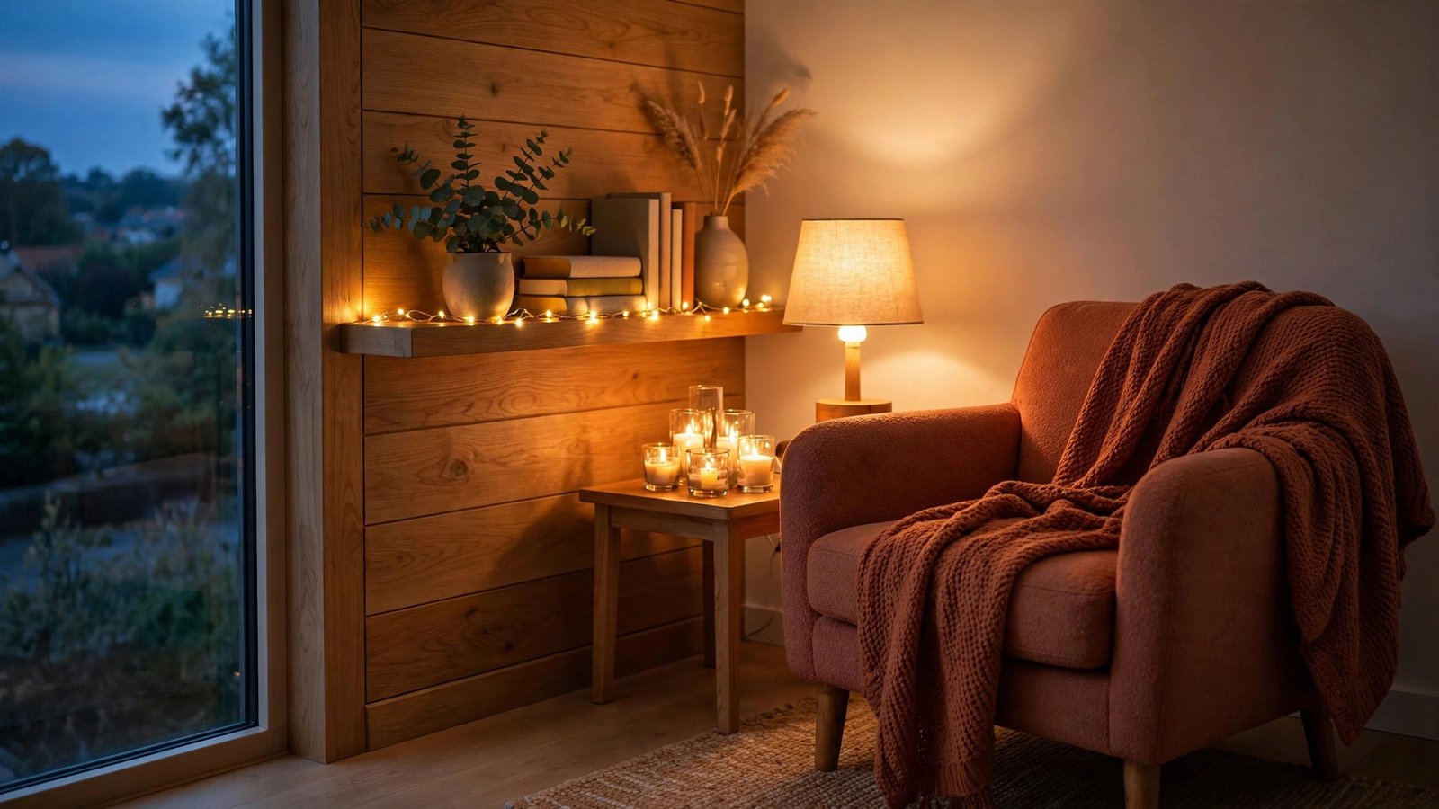
One overhead light is a crime against coziness. The reading corner in the image above uses three layers: a warm table lamp, a cluster of candles, and a low string of fairy lights along the shelf. Each layer sits at a different height, so the glow wraps around you instead of dropping from the ceiling.
Why it works: layered lighting at multiple heights mimics firelight, which humans are wired to find comforting. This suits: anyone who only ever switches on the big ceiling light and wonders why the room never feels cozy. To recreate this look, aim for three light sources per cozy corner — one task-level (lamp), one low (candles), one sparkle (string lights) — all warm-toned.
10. Design an Entryway Moment
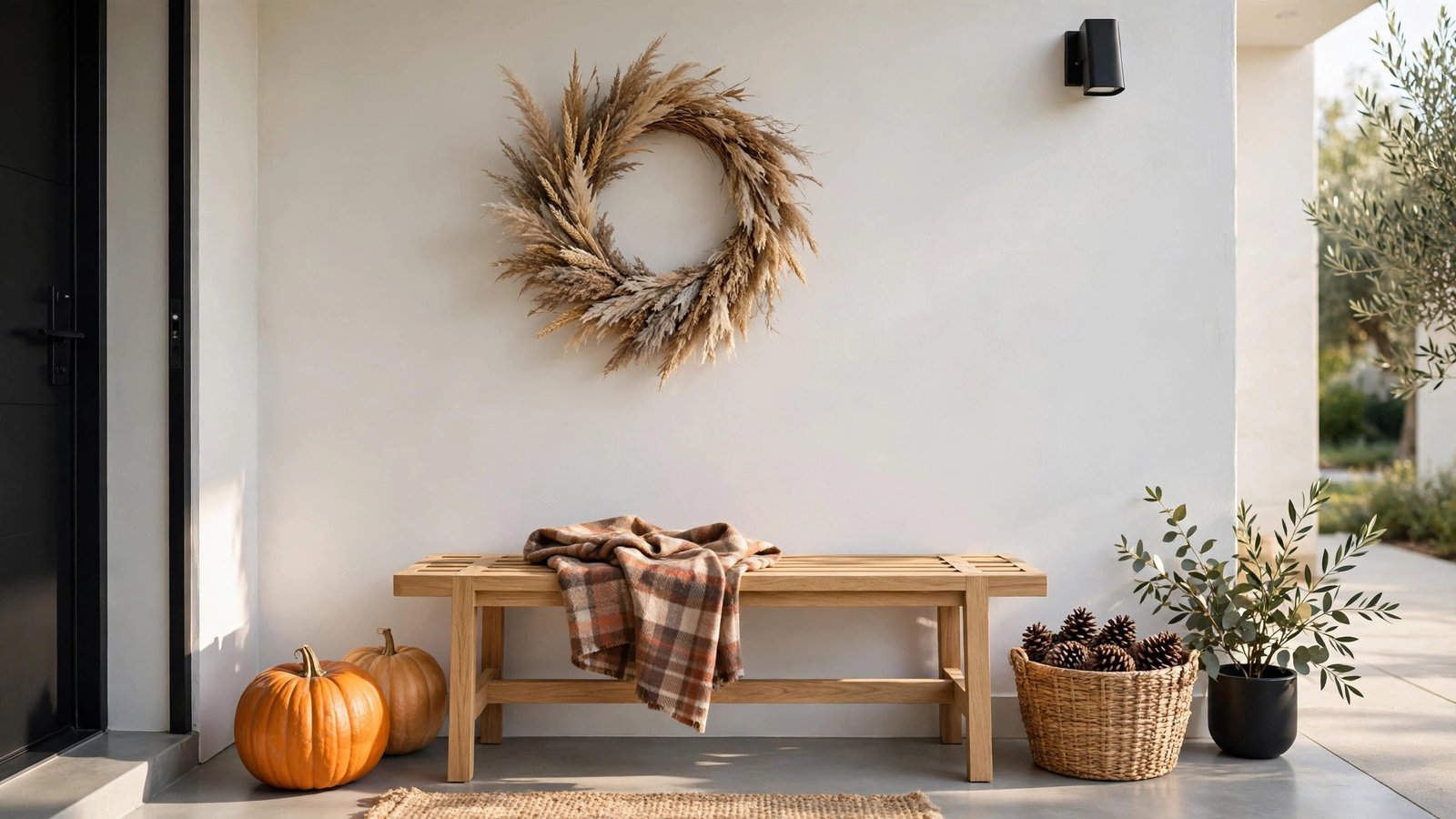
First impressions start at the door. In the image above, the entryway is a complete little scene: a wreath on the wall, a bench with a folded plaid throw, pumpkins and a basket of pinecones on the floor. You cross the threshold and the season has already begun — that’s the principle of the arrival sequence at work.
Why it works: the entryway sets expectations for the whole home; a styled one makes every room beyond it feel more considered. This suits: anyone who decorates the living room beautifully but leaves the hallway bare. To recreate this look, work in a triangle — something on the wall (wreath), something at seat height (throw on a bench), something on the floor (pumpkins or a basket) — and you’re done.
READ MORE >> 18 Budget Halloween Decor Finds That Look Straight Out of a Boutique
11. Leave Some Negative Space
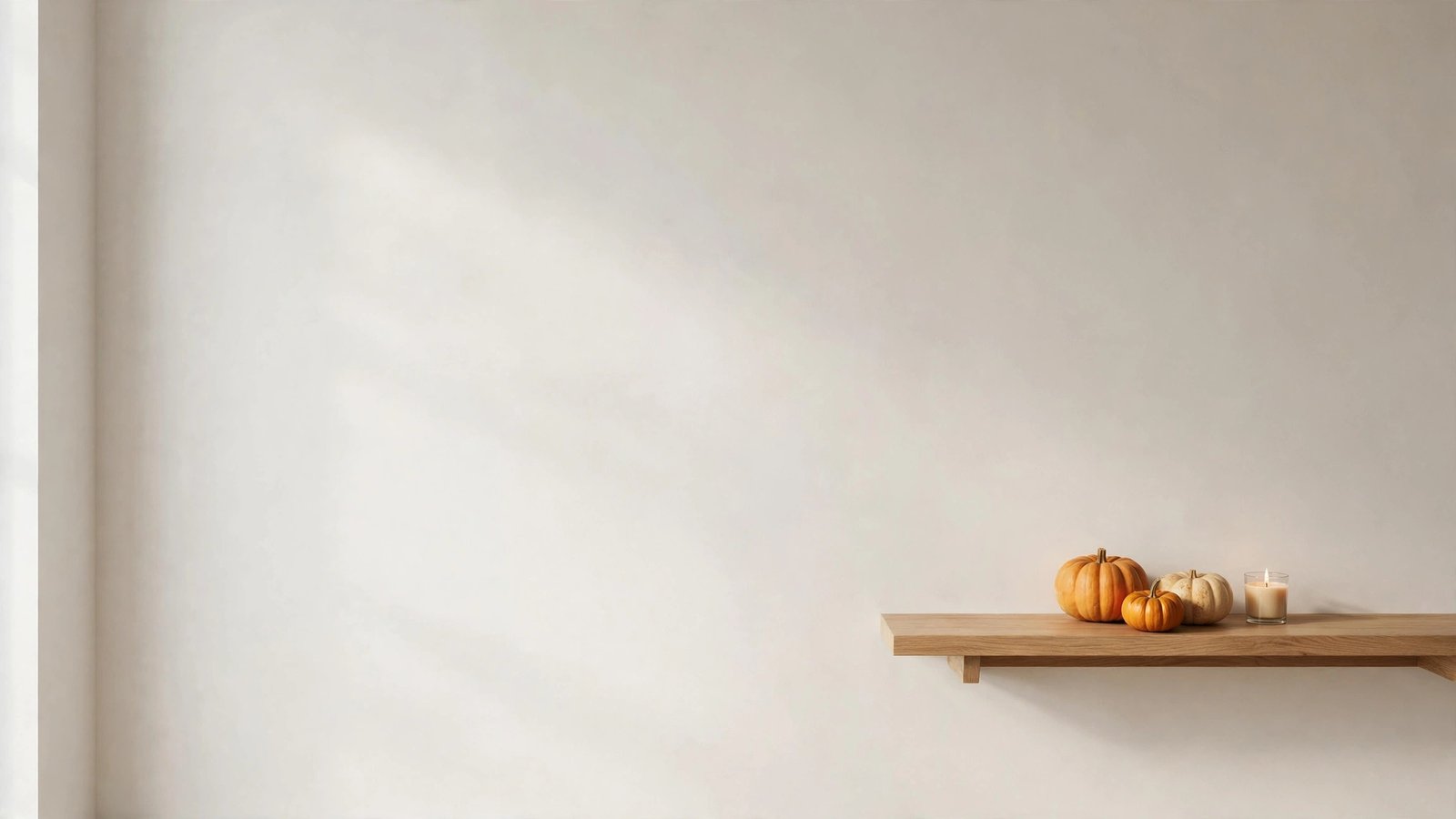
Restraint is a design choice too. The image above is almost empty — a floating shelf, three mini pumpkins, one candle, and a whole lot of calm wall. Negative space is the principle most fall decorators forget, but it’s what makes the decorated spots feel special instead of exhausting.
Why it works: empty space gives the eye somewhere to rest, which makes the styled moments nearby look more deliberate and luxurious. This suits: maximalists-in-recovery and small rooms where every surface is currently competing for attention. To recreate this look, pick one surface to leave completely bare for the season, and remove one item from every styled cluster — if you can’t tell what’s missing, it wasn’t needed.
12. Decorate for All Five Senses
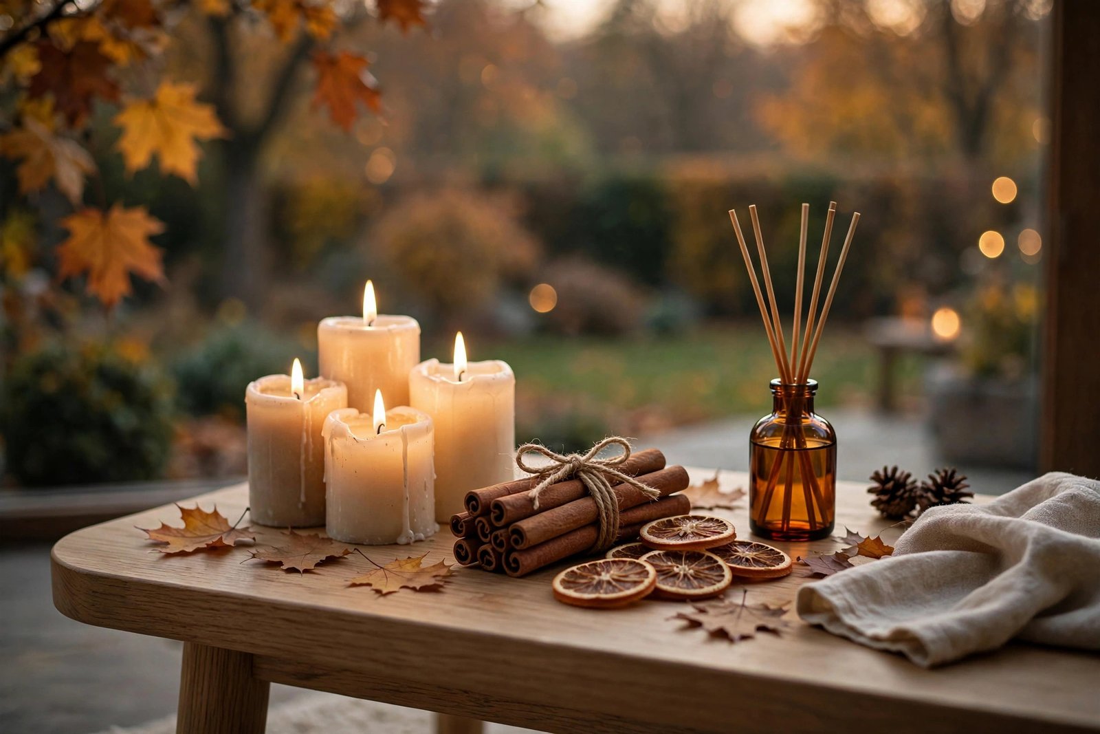
Don’t just decorate the eyes. The side table in the image above is styled for scent as much as sight: lit candles, cinnamon sticks tied with twine, dried orange slices, an amber diffuser. Fall is the most sensory season we have, and the homes that “feel” the most autumnal are engaging more than vision.
Why it works: scent and warm light bypass logic and go straight to memory and emotion — that’s why a cinnamon candle can make a plain room feel like October. This suits: renters who can’t change much visually, and anyone whose decor looks right but doesn’t feel right. To recreate this look, simmer a pot with orange slices, cinnamon, and cloves for an hour before guests arrive, and keep one spiced candle lit in the room you use most.
13. Transition, Don’t Tear Down
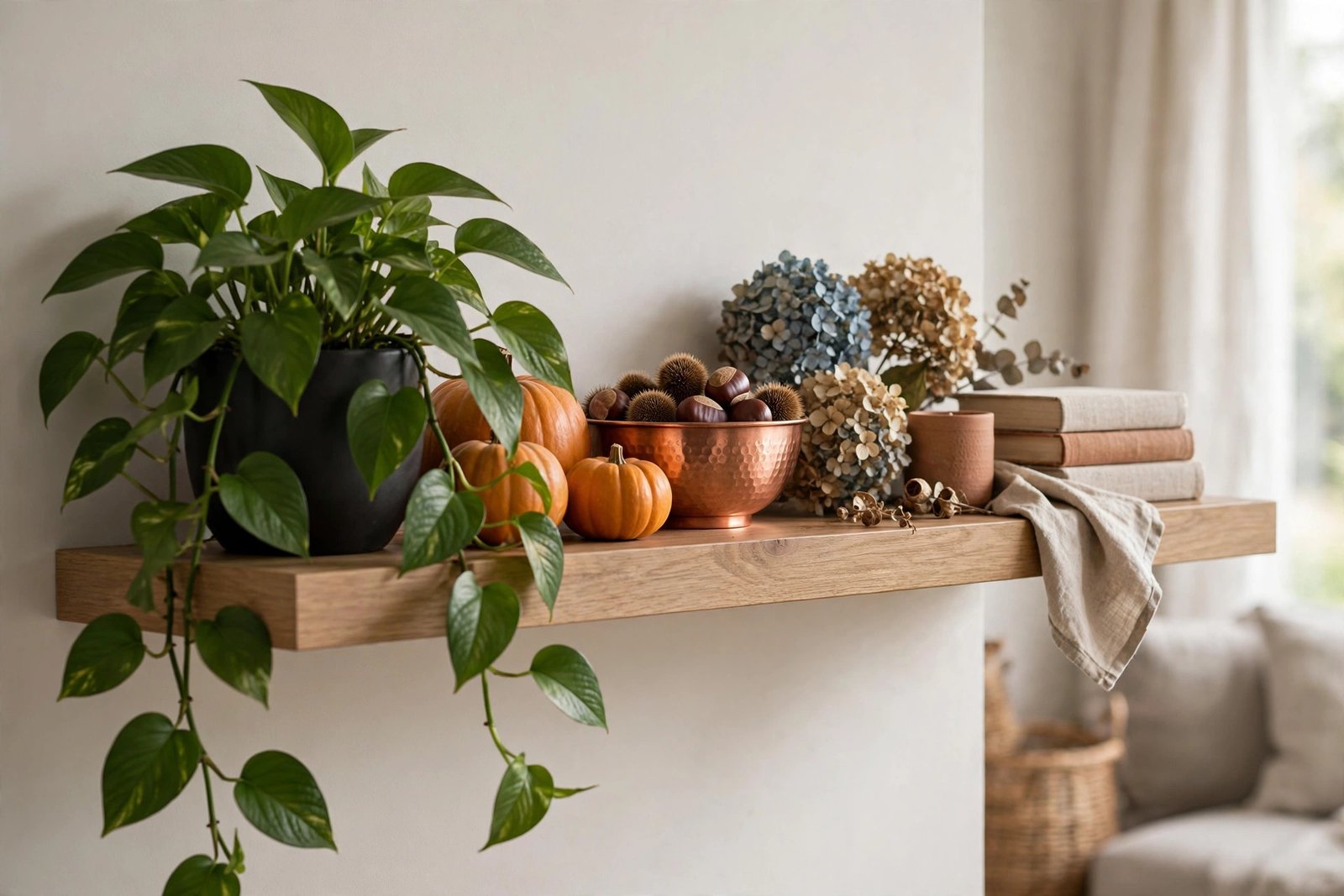
Evolution beats revolution. The shelf in the image above is mid-transition: the trailing green pothos stayed, but amber pumpkins, a copper bowl of chestnuts, and dried hydrangeas moved in around it. You don’t need a full seasonal overhaul — the smartest fall decorating is a gentle edit of what was already there.
Why it works: keeping your base decor and swapping only accents saves money and keeps the home feeling like itself, just in a warmer mood. This suits: busy people who love the idea of seasonal decor but dread the storage bins. To recreate this look, keep every green plant exactly where it is and add warm-toned accents around them — the green-to-amber gradient does the seasonal storytelling for you.
READ MORE >> 18 DIY Chicken Wire Ghost Ideas That Make Your Yard Look Haunted
14. Curate, Don’t Clutter
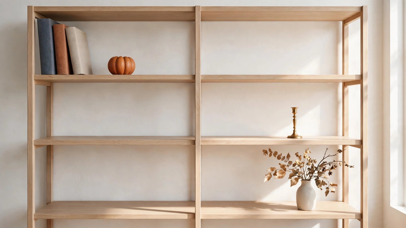
Every object should earn its shelf. The bookshelf in the image above holds just a few chosen things — art books, one ceramic pumpkin, a brass candlestick, a single dried stem — with generous empty space between groupings. Collecting is choosing; cluttering is accumulating. Fall gives you permission to do the first one on purpose.
Why it works: a curated shelf reads as confident and calm, while a crowded one reads as storage. The empty inches are doing as much work as the objects. This suits: anyone whose fall bins multiply every year. To recreate this look, pull everything off one shelf, put back only the pieces you genuinely love, and box the rest for one season — if you don’t miss them by Thanksgiving, donate them.
15. Tell a Story at the Table
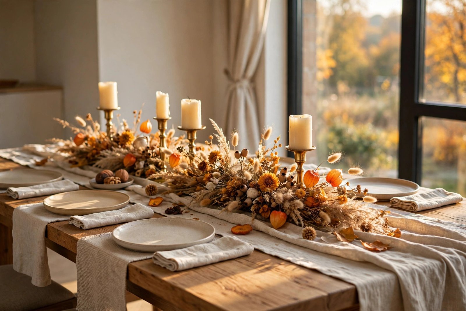
End where everyone gathers. The tablescape in the image above layers an oatmeal linen runner, dried grasses, brass candlesticks, and warm-neutral ceramics into a scene that says “stay a while.” A dining table is a narrative surface — every layer is a sentence in the story of a slow autumn evening.
Why it works: layered tablescapes signal hospitality and occasion, turning an ordinary Tuesday dinner into something worth remembering. This suits: hosts, holiday planners, and anyone who eats at the table daily but never dresses it. To recreate this look, start with a runner or cloth, add one low centerpiece you can see over, then candles at two heights — keep everything below eye level so conversation flows.
Principles You Can Keep Using
Here’s the real secret: none of these ideas expire on November 30th. Layering, odd numbers, contrast, scale, repetition — these are the same principles designers use in every season, just dressed in amber for October. Learn them once, and winter, spring, and summer decorating all get easier too.
So start with the one principle that spoke to you — maybe the rule of three, maybe the layered lighting — and try it this weekend. Then come back for the rest. Your home already has everything it needs to feel like fall; now you know the principles that make it look that way. Happy decorating.